A Marketer’s Checklist: Rebuilding Your Website Design and UX for Improved Brand Loyalty

A Marketer’s Checklist: Rebuilding Your Website Design and UX for Improved Brand Loyalty
When a website is glitchy, we get frustrated and leave over 50% of the time. People that are dissatisfied with your brand’s website do, too – not to mention, will likely never come back. After a bad experience, 88% of users are less likely to return to a website. Slow page load times, a slew of pop-ups that force you to restart your device or give personal information, a non-sensical navigation, and outdated designs that scream the early 2000s are just a few of the various aspects on your website that can ruin user experience (UX) and damage a brand’s reputation.
Your customers and prospects have a set of expectations when they land on your site; they might be looking for specific information in a pinch or plan to make a purchase in just a couple of clicks (queue why it’s crucial to understand your audience). To prioritize consumer satisfaction, you must first invest in a unique, favorable website UX and design.
Use this checklist to evaluate your current website and generate a game plan for a memorable, functional website that tells your brand backstory and accelerates conversions.
This checklist covers:
- Prioritizing Your Website (And Brand)’s Long-Term Goals
- Understanding Core Web Vitals and Optimizing for Success
- Implementing a Mobile-Responsive Design
- Taking Advantage of Data and Analytics for Site Structure Decisions
- Refreshing Website Design to Avoid Being Outdated
1. Prioritize Your Website’s Long-Term Goals and Strategy
Begin by asking yourself the purpose of your website. Is it to spread brand awareness and tell a story? Is it to create a connection between consumers and your brand and sell products? Once you can define what you want users to accomplish when they reach your website (hint: should be tracked as conversions in Google Analytics), creating a plan will be a smooth process.
It’s no secret that websites are resource intensive, which is why it’s crucial to make the most out of your investment by doing your research and building a site that supports the long-term. Understand how people interact with your website, their expectations, and where your industry is headed. These criteria should impact the structure of your site, which aspects are prioritized, and the type of content you plan to create.
Your site should be built to support expected functionality additions later down the line. For example, will your blog template eventually need the ability to integrate with social channels? What about being able to easily embed a video on any of your website pages? With the rapid growth and demand for video marketing, building that into your site today is a proactive move.
2. Check Your (Core Web) Vitals
When we go in for a checkup, one of the first things a nurse does is check our vitals. Websites are no different – core web vitals provide a summary of website health, specifically looking at load speeds for pages, elements, buttons, and more. Considering over half of users leave a site if it doesn’t load within three seconds, checking your vitals is integral. We recommend using Google Search Console or Semrush’s site audit feature.
Priority Check: Whether you’re creating a new website from scratch or making changes to your existing site, core web vitals should be a priority, as the Google Page Experience Update rollout is just around the corner. Sites with strong vitals should expect to see positive improvements in search engine rankings, while those with slower load times will likely see drops.
To ensure your website is in excellent health and to give yourself a competitive advantage in search results, reach out to a trusted expert in the web development space.
3. Invest in a Mobile-Responsive Design
While building a mobile-first website design isn’t a new concept, its impact on UX and SEO is ever-increasingly important as consumer expectations shift and Google updates its algorithms. Your mobile website should be treated separately from your desktop site, as users engage with brands on mobile in different ways than they do on a desktop or laptop. The convenience “on-the-go” factor should always be top of mind when strategizing for mobile.
Why do 53% of mobile users leave websites under three seconds?
- The entire page fails to load in the first few seconds.
- The website is unresponsive on mobile devices (text is extremely small and difficult to read, everything appears ‘zoomed out,’ and elements are not stacked).
- Design appears glitchy – whether images and text overlap, sections move around, or other constant distractions take up the screen such as pop-ups.
Check out these examples of mobile-responsive design from MorganMyers clients, Post Consumer Brands and The SCN Coalition – the text and images are stacked, filling up the full width of the page and making it easy to navigate:
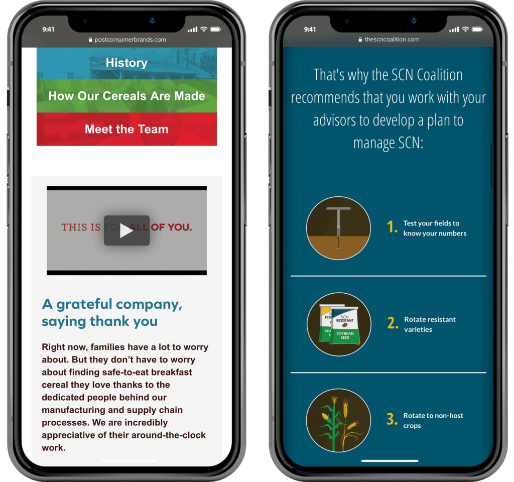
With 50% of e-commerce revenue coming from mobile users, mobile responsiveness should not be put on the backburner – especially if your website analytics show that a large makeup of users come from mobile devices. In our evolving mobile-first digital world, having a responsive mobile website will be integral to survival (not to mention, search engine rankings – as Google uses mobile-first indexing when determining website rankings, which looks at page load times).
4. Use Analytics to Determine Site Navigation and Structure
Your most important pages should be the easiest to find. By analyzing your Google Analytics data, you can see a clear picture of who visits your site, how they find it, your most popular content, and how they interact with it. (Hint: Take advantage of the Behavior Flow tool in Google Analytics to see the paths users take on your site, making it a go-to when determining a new sitemap or navigation structure for your header versus footer links.) Heat maps also provide a visual representation of the clickable ‘hot spots’ on your pages.
Once you’ve gathered your website data, decide how you’re going to display pages on your top nav bar and footer. (Hint: Your footer should only include up to eight links, and the anchor text should appear differently than the top nav bar.) Place your top-performing pages in hotspots found in your heat map analysis and make powerful content with fewer views accessible on top-performing pages. You can also use this information to add strategic internal linking on anchor text that points to another relevant page on your website. Not only does this make relevant content easily accessible, but it can also positively impact your search engine rankings.
Monitor performance monthly and adjust as you discover new trends in how users interact with your website and content.
5. Build Trust by Refreshing Design Elements
Ninety-four percent of users will not trust an outdated website, from “recent” blog content with publish dates from over a year ago to an ancient website design. To stay relevant and create a credible brand image, your design elements should have a simplistic, fresh feel – while staying recognizable and unique to your brand.
When freshening up your website design, consider these tips:
- The most important element on a page should stand out from the rest.
- Different page elements should be visually distinct from one another to create dimension and improve recognition.
- Call to actions should be obvious, using high contrast and a color that isn’t used anywhere else on the page.
- Prevent boredom by including catchy visuals, instead of large blocks of text, when possible.
- Colors used should stand out while staying ADA compliant.
With convenience at the heart of customer satisfaction, nothing is more important than speed and ease – especially on mobile devices. Brand websites must exceed user expectations in giving the consumer the answer, product, or information they’re looking for at the snap of their fingertips to gain their trust and loyalty. Otherwise, another brand will.
Balancing the technical and creative components of your site is necessary when building a fresh, positive UX. Our digital and creative teams work together to understand how various target audiences interact with websites and their expectations, as well as the ins and outs of developing a compelling, user-oriented website. Learn more about our capabilities.
 Back To Blog